
6 Mar
2012
6 Mar
'12
3:35 p.m.
Hi All,
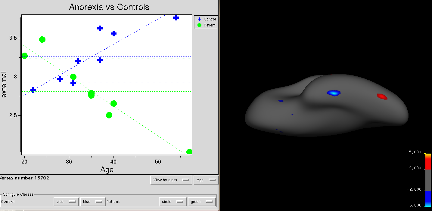
I'm having trouble reconciling the cluster colours with the graph that can be made when you load the group descriptor file and click on a point. I've attached an example.
In this study, I'm comparing thickness in a patient and control group, with age regressed out. The contrast I've used means that blue means control<patient. Therefore, patients are thicker than controls. But in the graph, patients don't seem to be thicker. I've seen the same results with red clusters (i.e. they should mean that controls are thicker but the graph shows otherwhise). Please let me know how I can interpret my findings given the graph. Which group is actually thicker?
Thank you, Allison